Ethan's BGGN 213 Portfolio
Class work for bioinformatics
Class 05: Data Visualization with GGPLOT
Ethan 2025-12-05
Today we are playing with plotting and graphics in R.
There are lots of ways to make cool figures in R. There is “base” R
graphics (plot(), hist(), boxplot(), etc.)
There are also add-on packages, like ggplot.
cars
##    speed dist
## 1      4    2
## 2      4   10
## 3      7    4
## 4      7   22
## 5      8   16
## 6      9   10
## 7     10   18
## 8     10   26
## 9     10   34
## 10    11   17
## 11    11   28
## 12    12   14
## 13    12   20
## 14    12   24
## 15    12   28
## 16    13   26
## 17    13   34
## 18    13   34
## 19    13   46
## 20    14   26
## 21    14   36
## 22    14   60
## 23    14   80
## 24    15   20
## 25    15   26
## 26    15   54
## 27    16   32
## 28    16   40
## 29    17   32
## 30    17   40
## 31    17   50
## 32    18   42
## 33    18   56
## 34    18   76
## 35    18   84
## 36    19   36
## 37    19   46
## 38    19   68
## 39    20   32
## 40    20   48
## 41    20   52
## 42    20   56
## 43    20   64
## 44    22   66
## 45    23   54
## 46    24   70
## 47    24   92
## 48    24   93
## 49    24  120
## 50    25   85
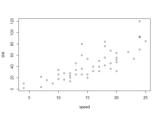
Let;s plot this with “base” R:
plot(cars)
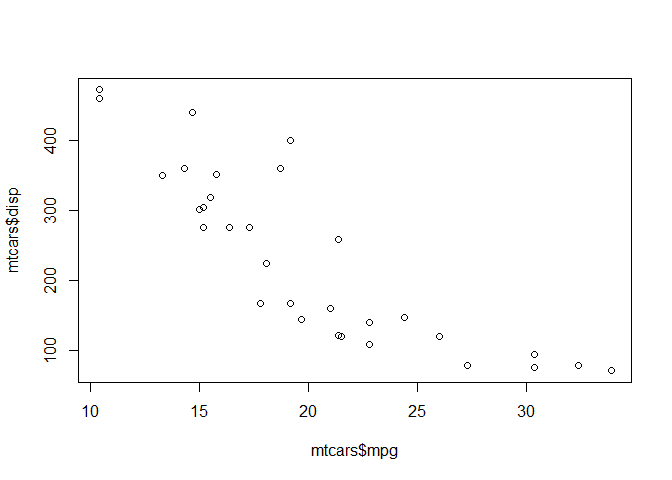
Plot of mpg vs. displacement
plot(mtcars$mpg, mtcars$disp)
GGPLOT
The main function in the GGPLOT2 package is ggplot. GGPLOT2 needs to
be installed first. Packages can be installed with the function
install.packages()
Note Do not install packages in individual files, install them in the global R console
Must call packages with a library() call in order to use their
functions
#install.packages("ggplot2")
library(ggplot2)
ggplot(cars) + aes(x=speed, y=dist) + geom_point()
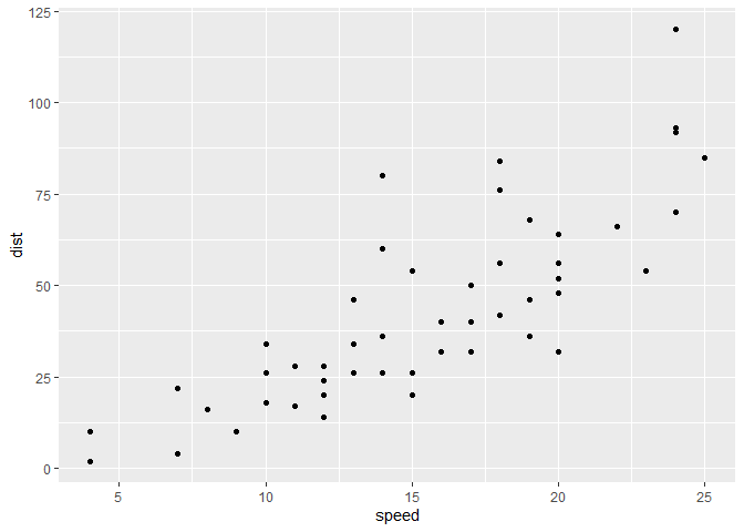
Every ggplot needs at least 3 things:
- The data (given with
ggplot(cars)) - The aesthetic mapping (given with
aes()) - The geometry (given with
geom_...)
For simple canned graphs “base” R is nearly always faster
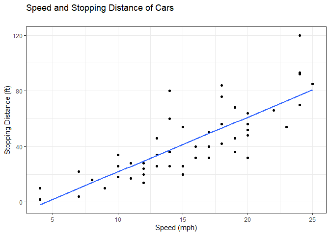
Adding more layers
ggplot(cars) +
  aes(x=speed, y=dist) +
  geom_point() +
  geom_smooth(method="lm", se=FALSE) +
  labs(x="Speed (mph)", y="Stopping Distance (ft)", title="Speed and Stopping Distance of Cars", subtitle="") +
  theme_bw()
## `geom_smooth()` using formula = 'y ~ x'
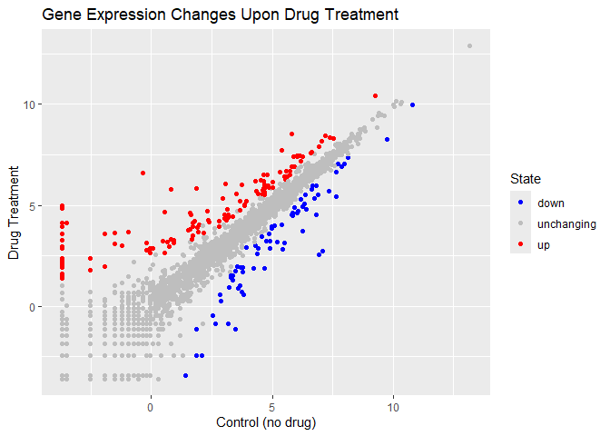
Plotting more relevant gene data
Loading in the dataset
url <- "https://bioboot.github.io/bimm143_S20/class-material/up_down_expression.txt"
genes <- read.delim(url)
Interrogating the shape of the data
nrow(genes)
## [1] 5196
ncol(genes)
## [1] 4
table(genes$State == "up")
##
## FALSE  TRUE
##  5069   127
round(table(genes$State)/nrow(genes) * 100, 2)
##
##       down unchanging         up
##       1.39      96.17       2.44
There are 5196 genes in this dataset
There are 127 upregulated genes in this dataset
Plotting the data in the genes dataframe
library(ggrepel)
p <- ggplot(genes) + aes(Condition1, Condition2, col=State) + geom_point()
p + scale_color_manual(values=c("blue", "gray", "red")) +
  labs(x="Control (no drug)", y="Drug Treatment", title="Gene Expression Changes Upon Drug Treatment")
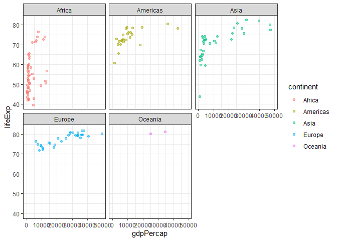
Gap Minder Dataset Plotting
Importing the data
url <- "https://raw.githubusercontent.com/jennybc/gapminder/master/inst/extdata/gapminder.tsv"

gapminder <- read.delim(url)

#install.packages("dplyr")
# install.packages("dplyr")  ## un-comment to install if needed
library(dplyr)
##
## Attaching package: 'dplyr'

## The following objects are masked from 'package:stats':
##
##     filter, lag

## The following objects are masked from 'package:base':
##
##     intersect, setdiff, setequal, union
ggplot
## function (data = NULL, mapping = aes(), ..., environment = parent.frame())
## {
##     UseMethod("ggplot")
## }
## <bytecode: 0x000001df4a30bd58>
## <environment: namespace:ggplot2>
gapminder_2007 <- gapminder %>% filter(year==2007)

ggplot(gapminder_2007) +
  aes(x=gdpPercap, y=lifeExp, color=continent) +
  geom_point(alpha=0.5) +
  facet_wrap(~continent) +
  theme_bw()
The Patchwork package can be useful for assembling multi-panel figures